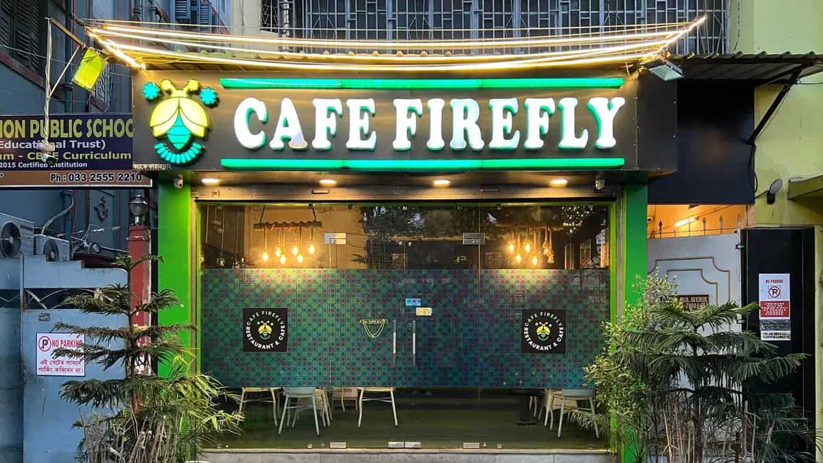
You feel it before you taste anything: a brief dimness after street glare, cool air under an arch, cane scraping lightly against stone-look flooring. Someone has engineered an arrival. In Kolkata, the newest café language is increasingly Rajbari-coded—courtyard hints, jaali shadows sliding across a tabletop, walls finished to suggest time.
If you’re café-hopping for ambience (or building a photo set without trying), learning to read Rajbari-inspired cafés in Kolkata changes the experience. Space starts to explain your pace, your order, even the second you lift a glass.
Why Rajbari Aesthetics Are Everywhere
“Rajbari-inspired” in a café doesn’t mean a palace replica. It’s a design moodboard built from heritage cues—courtyards (or their suggestion), arches, layered rooms, carved screens, warm low-glow light, and textured surfaces. In Kolkata, it reads as Kolkata-coded luxury: less marble-and-chrome, more patina, shade, and soft drama.
For many diners, the signal is threefold: nostalgia (North Kolkata house grammar; pujo pandal grandeur), occasion-ness (you crossed a threshold, not just “got coffee”), and photo-friendly warmth (amber light and tactile backdrops that make phone shots look less flat). This is a playbook—not a ranked directory—for telling what’s structural versus what’s recreated, and for noticing how the room steers the meal.
Ambience-led dining isn’t automatically shallow; it’s how people curate memory in a fast city. Short-form video helps: entrances, corridors, and that first reveal when the room opens up.
Rajbari Architecture Decoded
Rajbari homes were choreographed sequences—shade to sun, narrow to wide, public to private. The cafés that feel convincing borrow the choreography, not only the ornament.
Courtyard/uthan feeling: private yet public
A true courtyard is open-to-sky, but cafés often build a courtyard feeling: a central light well, a double-height void, plants under a brighter patch, or a skylight that lets the middle of the plan breathe. It feels “private yet public”—you’re among people, but your eyes have somewhere to rest besides other diners.
Micro-example: a central open void with tables around it makes solo coffee feel less exposed; your gaze can travel upward.
Corridors and layered rooms: discovery by design
Heritage houses move you through corridors, verandahs, and layered rooms. In cafés, that becomes sequencing: a tight entry, then a wider seating area; a side passage that reveals a quieter nook; a back room that feels “found.” Compression-and-expansion also solves real café problems—different group sizes, different noise zones—without signs announcing a “Quiet Corner.”
Threshold drama: arches, columns, portals
The most borrowed cue is the threshold: arches, columns, a framed doorway, sometimes a dim vestibule before the brighter room beyond. It slows you down—just enough to switch from traffic-brain to table-brain—and photographs well because it gives a built-in frame.
Micro-example: arched entry + dim vestibule + one brighter room beyond = an arrival shot you don’t have to choreograph.
Jaali, woodwork, patina: texture that behaves in low light
Jaali screens, slatted shutters, old-style woodwork, and “aged” surfaces do two jobs. First, they create shadow play that shifts while you eat—patterns moving across plates, hands, and glass. Second, they add micro-contrast: warm bulbs can hold detail on texture where a flat wall turns into a blank, noisy phone photo.
Texture also changes sound. Cane, wood, and fabric soften echoes; conversation feels less like it’s ricocheting around a glass box.
Palette and lighting: amber, gold, deliberate dimness
Rajbari-inspired cafés typically reject bright “work light.” Instead: warm bulbs, sconces, lantern cues—light that behaves like evening even at 3 pm. Brass reads clearly. Syrups look darker. Steam becomes visible.
Best-practice interiors keep enough task light to read menus and see your plate; deliberate dimness shouldn’t become discomfort.
Best-practice note: comfort and safety can coexist with heritage cues
The strongest moodboards don’t punish you for the look. Notice quiet ventilation, accessible paths (ramps or gentle transitions rather than surprise steps), and seating ergonomics that survive a 90-minute conversation.
Adaptive Reuse Vs Heritage-Inspired Buildouts
There are two legitimate ways Rajbari aesthetics show up in Kolkata Rajbari cafés—and confusing them leads to bad takes.
Adaptive reuse is when an existing older structure is repurposed for hospitality. The bones are real; the café is a new chapter in an old shell.
Heritage-inspired buildout is when a café creates Rajbari motifs inside a newer shell (or a heavily altered one). Done well, it isn’t “fake”; it’s referencing. The problem starts when the space implies it’s a preserved heritage without saying so.
Simple spotting cues (without playing detective)
You don’t need architecture training—just notice what’s structural versus what’s applied.
- Irregular geometry: older buildings often have inconsistent wall lines, awkward angles, or stairs that don’t follow modern comfort rules.
- Wall thickness and deep-set openings: heritage windows and doorways may sit deep rather than reading like surface cut-outs.
- Original elements with honest wear: timber with real grain variation; stone or mosaic worn unevenly where feet would actually land.
- Ventilation logic: high vents, transoms, and cross-breeze planning hint at pre-AC design thinking.
- Structural vs decorative columns: load-bearing columns align with beams; decorative ones often look “placed for photos.”
- Telltale new distressing: uniform patina everywhere, identical faux-cracks, evenly sanded “aged” paint—age applied like a filter.
What cafés keep, replicate, or simplify—and why
Even in adaptive reuse, cafés tend to preserve structural bones (walls, stair cores, courtyard proportions) but update finishes for hygiene, wiring, and safety. In motif-led interiors, designers often replicate the surface language (arches, jaali panels, antique-looking lamps) because true courtyard engineering, drainage, and retrofitting are expensive and code-heavy.
Simplification isn’t automatically disrespectful. Budget, fire exits, kitchen exhaust, and crowd flow force edits. The best spaces are honest about what’s inherited and what’s designed.
Respect vs tokenism: the ethics of “inspired by”
Respectful borrowing usually looks like:
- Credit: language that clearly says “inspired by,” not invented lineage.
- Local craft: cane, wood, and metalwork commissioned from regional artisans rather than mass-produced “royal décor.”
- Specificity: materials and patterns that nod to Bengal craft traditions, not generic palace wallpaper.
Tokenism shows up as:
- Caricature: thrones/crowns pasted onto unrelated design.
- Misinformation: confident origin stories that don’t hold up.
- Erasure: “heritage” used as a vibe while provenance disappears.
A diner’s safeguard: avoid declaring a place “real” or “fake” unless you’ve verified building history. Better to ask: what here is structure, and what here is styling?
How The Rajbari Vibe Shapes Menus, Drinks, And Service
Design isn’t a backdrop; it’s a quiet manager. Rajbari-coded rooms nudge cafés toward certain flavours, formats, and rituals because the space asks for coherence.
Nostalgia-led Bengali comfort: the safest pairing (and why it works)
Warm light and textured rooms prime you for comfort flavours—mustard, poppy seed, ghee, roasted cumin, slow-cooked onion. Even when the menu is pan-Indian or global, diners reach for anchors: a kosha-style gravy, a luchi-adjacent fry bread, a mishti finale.
Amber lighting also flatters browns and reds, which subtly suits caramelised onion, tea, jaggery, and fried edges.
Micro-example: lamp-lit room + clay cup + visible steam = your hot drink becomes part of the room’s theatre.
Royal cues without clichés: format does the work
The best menus signal an occasion without selling fantasy. Instead of shouting “royal,” they use formats that feel communal and paced:
- Shared plates that invite passing bowls across the table
- Thali-style assemblies (not necessarily traditional) that turn variety into one readable frame
- Sweet finales served as punctuation—payesh-like textures, jaggery notes, a clean dairy finish
Micro-example: brass/cane/terracotta serviceware + a thali-like spread = occasion, without a single “Raj” label.
Drinks echoing the moodboard: colour, glassware, scent
In Rajbari-inspired cafés, drinks do visual work. Warm low-glow light holds deep ambers, reds, tea-browns, and herb greens—colours that stay readable on camera without flash.
Expect:
- Sherbet-style refreshers (citrus, basil, vetiver/khus, rose) in tall glasses that catch lantern light
- Spice sodas where aroma does as much as taste—black salt, toasted jeera, ginger—because scent travels in quieter rooms
- Light theatrics used sparingly: a singed herb, a brief cloche lift
Glassware is part of the brief: cut-glass throws prismatic highlights; brass-lined cups warm the hand; matte clay mutes shine and makes steam more visible.
Best-practice note: cafés should resist using “raj/royal” as a flavour descriptor. Clear provenance beats vague grandeur—name the chilli, the jaggery, the tea, the region.
Service rituals and soundscape: completing the atmosphere
Rajbari moodboards collapse when service behaves like fast-casual counter dining. They click when cues follow the room:
- Pace: a pause between order and first course suits layered plans
- Plating restraint: enough negative space for brass and pottery to read
- One-line context: a server who can explain why a drink is built for warm light, or why a dish arrives in clay
- Sound discipline: controlled bar clatter, music that doesn’t fight conversation
Want to recreate the sherbet-and-spice drink vibe at home—or find similar profiles? Explore CocktailSifter
How To Experience A Rajbari-Inspired Café Like An Architecture Lover
You don’t need a crawl. One visit is enough if you arrive with a few habits—and leave room for surprise.
Spot-the-details checklist (use it once, then put your phone down)
- Threshold: arch/portal/vestibule that slows you down
- Courtyard cue: a central void, skylight, or “inner sky” suggestion
- Light and shadow: jaali/shutters/plants creating moving patterns
- Materials & craft: real wood/cane/stone; joinery, carving, metalwork you can’t fake cheaply
- Sound: does the room absorb noise or bounce it back?
- Seating layout: layered privacy (edges, nooks, back room) versus one open hall
Best times to visit (brief, non-prescriptive)
For shadow play, go when daylight still has an angle—late morning to mid-afternoon. For calmer sound, try early opening hours or the lull between late lunch and evening. For warm-light photos, come after sunset and let lamps do the work.
Questions to ask staff that unlock the story
- Was this building always a café? If not, what was it before?
- What did you retain versus recreate? Floors, doors, staircase, courtyard—what’s original?
- Who made the craft elements? Any local cane workers, carpenters, metal artisans involved?
- Why is this dish/drink served this way? (Brass vs glass, clay vs ceramic, shared platter vs single plate.)
- What’s one design detail you wish people noticed?
If you want curated, place-based explorations without turning this article into a directory: Browse Food Trails
Conclusion
The Rajbari trick isn’t only the arch; it’s how the room teaches you to slow down. A threshold changes your gait. A courtyard cue gives your eyes a resting place. Texture makes warm light behave—and makes food look like it belongs.
On your next café visit, pick one cue to notice (light, threshold, or surface), and ask one question: what here was retained, and what was made to look retained? The answer is usually more interesting than the menu copy—and it’s how you start belonging to the building, not just occupying a table.
Some parts of this article were created with AI assistance.